Thursday 24 October 2013

Seminar 3: Semiotics


A sign is a meaning within cultural codes, which are accepted systems of meaning.

signifier     
______ -----> Denotative/connotative
signified          (myth)

Myth is a simplified version/social shortcut for understanding
For illustrators understanding this is important because adding another image to where it doesn't adhere with the already withstanding code makes it interesting and gets it noticed!


Task: Semiotic analysis of an illustration, look at:
the connotations and mythical meaning 
the cultural codes
the difference between denotation and connotation
types of sign at work within the image
what is means, how its exemplified, why does it have those meanings?
denotative features: 
connotative interpretations:

Mythic character:
specific character:


I will be looking at the American illustrator Brad Holland's work 'Red'. He is renowned for conceiving and producing striking visual concepts for a range of contextual uses. This particular image is to promote a production entitled 'Red' by the Wharf Theatre Co. The visual message conveys a comment on the effect the Communist Revolution and Red Guard had on traditional Chinese theatre. The face is in theatre makeup, so is an actor directly affected by this movement; the image is cropped so just her face is visible; the emotion lies in the face, it is a very powerful tool for the actor, however hers appears expressionless and she is not free to express herself; emotionally or politically.
Communists aimed to remove the traditional ways of the theatre which they believe was propaganda reflecting the views of those in power, they introduced rules but in doing so restricted the creativity of the theatre. Even the villain was not as important in what the hero was working against, and there was no variation tolerated in the design of this character as that would be seen as distorting the message of the play, and possibly supporting the bourgeoisie. These characters were given the burden of carrying out the story of the play and had to do it in a way that is in full support of the communist parties ideas. The other characters mentioned in the three prominence's were the general 'hero's and the 'positive'  characters/the crowd.  The latter's soul purpose was to raise up the main heroic character as well as to establish a relationship between them; there was never specific qualities assigned to characters but through their relationship the hero is seen as 'one of the people' and sympathetic to the problems of the average person. The 'negative characters' which are sometimes not mentioned, were often portrayed as the Japanese officers or nationalist movement, or armies or spies. These characters were enemies of the proletariat class, however they were not needed as the class struggle could be portrayed without them. The 'changing characters' were very important in portraying the goodness of the main heroic character; they were not bad people, they were simply mislead and they were corrected, thanks to the heroic characters. This change in the literature stifled those in the creative industry and those in the audience looking for freedom and self expression. The girl crying red tears expresses the pain and frustration of the repressed people and their art. 

This was not the only way the communist party utilized theatre; touring troops were a problem because the government viewed anyone who was an itinerant was not assisting society, however they were a solution to spreading the message of communism to the country; so they were allowed to travel but had to have a 'home town' from which they were working from and while they visited villages they were to help out. Eventually amateur theatre set up by the government also spread the communist message. The girl in the image cries red tears, has red lips and cheeks and the image is even titled 'Red'; she is covered in communist connotations, advertising it just like the actors; not out of choice. Her face gives nothing away, yet the wounded eyes repulses the audience, suggesting that although the theatres went along with the communist action, it killed the art and their passion. 
The media channels and theory supporters overwhelmed those who were against the theories put forth by the party; they rejected the rigidity and imposition of the formula for creative work. Western theatre in china was established by the 1930's, but during the cultural revolution, particularly 1966-76, all aspects of western theatre were completely band. 
The image is titled 'Red' which is a device to make the audience think about the other connotations we have to the simple word 'red'. Blood has a direct link to this colour and especially when put in reference to the 'Red Guard' reminds us of the brutal murders; in the image itself it reflects too the brutal 'murder' of theatre by the Red Guard and by Communist regulations. The Red Guard started as China's youth responding to Mao's appeal for a violent class struggle to get rid of the 'revisionists' (he said that bourgeois elements were infiltrating the government and society at large aiming to restore capitalism) but it spread to the military, urban workers, and the communist party leadership itself. This resulted in mass murder 
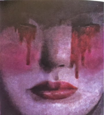
Her face stays utterly composed yet her eyes pour red tears; the blood of the millions of people who were persecuted in the violent struggles and who suffered a wide range of abuses including public humiliation, arbitrary imprisonment, torture, sustained harassment, and seizure of property; along with the morning over the historical relics and artifacts destroyed and the cultural and religious sites that were ransacked. The composed face reminds the audience of theatre but also it completely juxtaposes it; instead of the free expressed emotion and creativity you are faced with a completely hidden emotion and false sense of calm which is even more disturbing for the viewer. To hide emotion, views and opinions would have been continual during this strict reign of the Communists. 

Brad Holland interview and images here: http://bado-badosblog.blogspot.co.uk/2011/11/brad-holland-in-new-yorker.html

Thursday 17 October 2013

Seminar 2: An Introduction to Semiotics

Semiotics is the science of studying signs. 

MEANING 


Ferdinand de Saussure (Swiss Linguist)

There is no innate meaning to anything.
It is the process of learning how and what things mean within the agreed systems of meaning.


KEY WORDS (code, sign, signifier, signified, arbitrary, denotation, connotation, myth)

What is the importance of meaning in the study of art, design and culture?

Structuralism- structures and systems that produce things, in semiotics this refers to meaning.

We take for granted that something naturally means something... this is dangerous!

We can unravel meaning in cultural practice, if we take culture as operating like language.

A code is a system of symbols or signs. 

For example, fashion is a whole sign system. The clothes/accessories are designed to give off a certain impression; this is a cultural code. A tie is another example, it is intrinsically meaningless but it signifies smartness and status because of our cultural code. However, punks destablished that cultural code and became so sub-cultural and potent due to this. 


As an illustrator if you understand cultural practice you can opperate within the cultural codes or jetsam them.
For example, star wars is much like a western in the way the goodies all wear white and the baddies black.

Codes are found in all forms of cultural practice.

Saussure stated that within codes are signs and that sings are split into the signifier (sound/image) and the signified (mental concept).

Signifier 


  • Written word e.g. 'dog'
  • Spoken word e.g. 'dog'
  • Barking by dog
  • Picture of a dog
Signified
  • Mental image of a dog
The relationship between both is arbitrary. 

Question why certain things mean certain things.
Feminine vs masculine?

Roland Barthes book Mythologies contains many examples and analysis. 


Denotation is the basic understanding of dog -e.g. a four legged creature.
Connotation is the associational meaning of dog e.g. loyalty, companionship, walks etc.

Advertisements and illustrations use layer upon layer of connotations. 


Meaning within society isn't questioned it is just accepted.

The myths which suffuse our lives are insidious precisely because they appear so natural. - specific connotations are being naturalised.

The meanings of signs shift. They come from people not the image itself.
By analysing the connotational content of cultural artifacts we can access ideological meaning which can help us understand how culture operates.

Wednesday 16 October 2013

Lecture 2: Visual Literacy

Visual Literacy - The Language of Design

Fred put an image of an apple on screen and said 'this is not an apple' - he meant  it is merely the image of an apple.

This reminded me of 'The Treachery of Images' by the Belgian Rene Magritte in which he writes in french below 'this is not a pipe.' it is just a representation of one. 


This is also like Korzybski's 'the map is not the territory' which stated that an abstraction derived from something, or a reaction to it, is not the thing itself. Korzybski held that many people do confuse maps with territories, that is, confuse models of reality with reality itself. 


In the lecture visual communication was described as a process of sending and receiving messages using type and images. It is based on a level of shared understanding of signs, symbols, gestures and objects, and it is affected by audience, context, media and method of distribution.

Visual Literacy was described as...


  • The ability to construct meaning from visual images and type. 
  • To interpret images from the present, the past and a range of cultures and provide images that effectively deliver a message to an audience. 
  • To interpret, negotiate, and make meaning from an image. 
  • The idea that pictures can be read.
All that is necessary for any language to exist is agreement amongst a group of people that one thing will stand for another. 

Visual language can change, for example the symbol for hospitals/aid has changed from red to green however the red is still understood just not used practically.

Visual Communication is made up of presentation symbols whose meaning results from their existence in particular contexts. 
The conversions of viscom = universal and cultural symbols.

The Nazi party adapted the Buddhist symbol of peace and reversed it to become their logo for their fascist and racist party; this shows how important visual semantics are. They are a cultural reference point.
Visual syntax

Semantics 


Semiotics- study of signs and symbols - for example; sign process, indication , likeness and analogy metaphor.

Symbol (logo)

Sign (identity)
Signifier (brand)

New York re-branded itself the 'Big Apple' to appear fresh, crisp and good for you.  

Visual Synecdoche - part is used to represent the whole and vice versa. The main subject is simply substituted for something that is inherently connected to it and universally recognised.

Visual M
etonym - symbolic image that is used to make refece to something with a more literal meaning.

Visual Metaphor - used to transfer the meaning from one image to another. Conveys a close relationship. 


'Work the metaphor. Every object has the capacity to stand for something other than what is apparent. Work on what it stands for.'
- Bruce Mau

Tuesday 15 October 2013

500 Words Compare and Contrast Two Sources

In this essay I will compare and contrast two posters, one by Savile Lumley (SL) and the other by Schumacher & Ettlinger (SE). 

The first is a propaganda piece, used to convince men to sign up to the British army. It was produced at a time where the army was suffering heavy losses and soon after conscription was introduced in the Military Service Act 1916. Posters like these were vital to the success of the army. It is effective as it uses devices to play on consciences of the audience; the male character avoids eye contact with the child, instead making a connection with the viewer by staring directly at them. It reminds the reader that this war would not be forgotten; did they want to embarrass and disappoint their children by not contributing? The toy soldiers are used to undermine the serious of the war, however in hindsight this is ironic as phrases like ‘lions led by donkeys’ suggested that the soldiers were just toys to those in power.

The second is advertising a range. It took advantage of a time of celebration of America and became the all American range; ‘The Uncle Sam Range’. Uncle Sam (initials US) was a personification of the American government. The artwork relies on the reputation of a prosperous America to sell the range as the celebration of the great food the American range produced coincides with Independence Day. The scene is set in Philadelphia, which was the epicenter for celebration 100years after the adoption of the formal declaration of Independence 1776; it decreed that the 13 colonies were separate from the British. It stated ‘all men were created equal’ which appears ironic in this poster due to its racist and mocking tone; the bill on the table goes beyond stereotypes to suggest what each country eats. The countries seated around the table are portrayed like inferior children; reminding the audience that America had succeeded in dominating the west as well as suggesting Africa is the biggest mouth to feed. As it was produced just after the civil war it was insensitive and offensive as although the union victory had freed 4 million slaves, the legacy of slavery continued. It also touches a raw nerve with the mentioning of potatoes as it was 20 years after the Irish Potato Famine in which 1 million died and another million emigrated. These factors were all used to exert American cultural superiority suggesting that with this range you will never go hungry like other nations.

SL’s poster uses direct language; common in propaganda posters. It uses a rhetorical question to grab the reader’s attention and an innocent style of font to reflect the child’s question and make the war seem less daunting; whereas SE used saloon font to remind the viewer of Americas dominance in the ‘wild wild west’. The language used creates an emotive response in the male audience as it leads them to think of their own or future children and how they would disappoint them by not joining the force. At the time there had been heavy losses so the language projects future success calling it the ‘Great War’; it implies that it is their patriotic duty to sign up.

Imagery is used to convey a patriotic message. SLs poster contains the Tudor rose; the plant badge of England, and the fleur de lys; representing purity and right direction as well as England’s loyalty to their French allies. The second poster uses the American flag and bald eagle; which was chosen as the US emblem due to its long life, majestic looks and great strength; it was also believed to only exist in their continent. 


Both posters use realistic illustration to make the scenes and characters within them more relatable; both depicting white males as this was the majority of their target audience. Contemporary men were in control of the household and the money; they would have made the ‘important’ decisions such as purchasing the range or going to war.  It was their patriotic duty as men to fight for the future of Britain; represented by the children characters, but was aimed at all classes even though it portrays an affluent family scene, this was because it was selling an affluent lifestyle. The range advert uses the male character Uncle Sam, positioned in the centre, being waited on having food at his demand, thanks to the range, to appeal to contemporary men. Both posters also portray a homely atmosphere which helps to sell the lifestyle you potentially could have if you follow the posters; the easy life could be yours as long as you do your duty by either signing up to the army, or buying The Uncle Same Range. 


Monday 14 October 2013

Illustrators Vs Fine Artists

Ben Kelly, City Painting.
This painting, worked up from initial sketchbook drawings, was developed for an exhibition of the illustrator as artist.

Context of Practice 1st Seminar

During this introductory seminar we learnt about what COP would consist of. We also had to show our 5 inspiration blog posts and these were really interesting to learn about the individual and what work they were into. Some of it inspired me and some of it didn't however it was really insightful as it taught me about work I may not have discovered on my own. 

My notes of things to research by the end of the session included:


  • Experimental Jetset - political
  • May '68 posters by Parisian art students - revolutionary posters
  • Steve Bell
  • Ellen Davis - comics with serious subject matter
  • Hawkeye Initiative - tumblr?
  • Picasso - 5 prostitutes 
  • James Jean
  • Hyde Park Picturehouse - for more alternative films
  • Dr Seuss- Mitchell McNaughton
  • 'North European' design - knowingly awkward

Context of Practice Lecture 1

I found my first lecture great and very interesting as I already have a love of history. I think its good that we can get a knowledge for other subjects within this module too, as it can only enhance our own work.

In this lecture I learnt about a small amount of context for each topic.

Photography


I learnt about the Worktown Project by Harrison, Jennings, Madge and Spender, which documented Bolton, specifically the Worktown people. The context behind this piece included the Wall Street Crash 1929, the Great Depression 1930+, Hilter coming into power 1933, and the British Union of Fascists formed 1932. These factors help to highlight the agenda of the photographer and the seeming neutrality of it.

Animation


I watched Jiri Trnka, The Hand 1965 animation. I thought this was a really effective animation especially in terms of symbolism and creating a heavy and serious atmosphere within an animation. In this sense it reminded me of Persepolis the animation based on the graphic novel, which portrays an Iranian girl growing up in Iran and France. 
The Hand was created in Czechoslovakia in the height of the Cold War, 20 years after the end of WWII. Czechoslovakia at the time had state censorship of the arts which meant many creatives felt repressed; this is a huge theme of the animation. It is a precursor to the Prague Spring of 1968. It is a radical animation and this type of animation is generally not shown in western culture, like Tony Kaye's Tested for the Unexpected 1993 which was shot in black and white and broke new ground in post modernism.
Illustration

We looked at Norman Rockwell, once known as 'Americas illustrator', his work was cringey, warm and realistic; it was what appealed to Americans at that time.

Type

We looked at the history of type within three cultures and how they represented the points of that culture. The Nazis used Fraktur, a font that the goths in the middle ages used, this portrayed a message of domination through force. The 30's British newspaper The Times used Times New Roman to try to equate the greatness of the British Empire with the Roman Empire and its national superiority. Modern Europeans used Bayer-Universal type which had no capital letters; this was used to portray unification.

Wednesday 9 October 2013

5 Inspirations


Currently, my favourite illustrator has to be Minni Havas because her work, both finished and sketches, are constant inspiration to me. I love her style and choice of colour palettes and that her work focuses on portraiture. I love her realistic yet imaginative style, which combines her skill and creativity to capture the personality of the individual and the atmosphere of the piece.


She describes her work as existing 'somewhere in the borderlands of the real and the imaginary.' 


A reasonably recent inspirational artist to me has been Hattie Stewart, a self confessed 'professional doodler'. I love the playfulness and feeling of fun within her work, she takes the serious subject matter and uses her artwork to allow us to breathe; to realise it is okay not to be perfect. Her work heavily influenced my final major project in my foundation course and I love how free her style is yet how carefully planned and designed the 'doodles' are.


I also love the old school style of the Australian illustrator Minna Gilligan.
 I absolutely love passionate colour in all her images and although I don't use much collage in my work I really appreciate how Minna uses it and the narrative the combination of images conveys. She manages to create one powerful image using many contrasting components. Personally, I don't think all her work is the most technically great but I love the fact that it can evoke such emotion within such simple images, and by managing this she is definitely one of my five!


Another one of my favourites is Marcel Vertes. Not only do I love the way he depicts clothing and movement but also his depiction of society and individuals. His talent in colour and line fascinate me and it amazes me how with the simplest sweep of line he can create an emotion, expression, even an entire narrative. I love how David Downtown described his work in his book 'Masters of Fashion Illustration'; 

'Of course, humour had always been a part of the fashion artist's repertoire...but Vertes went further; his drawings of the beau monde shimmer with gleeful malice, while his dancing line and joyful Dufyesque colours diverted the eye and soothed the very egos they ruffled...what he sought, and frequently found, was enchantment.'


'Like Sisters Really! Vertes could be delightfully malicious, as here, sending up the 'distinct recent phenomenon, the perpetually adolescent mother and her daughter' in 1936'.- Downtown.
'Straighten Your Tie! Vertes could never resist sending up fashionable society. This illustration appeared in Vogue in 1936.' -Downtown.


It is the satire and humour within 
Nigel Buchanan's work which makes him my fifth inspiration.
However work such as Bikini; with its ridiculous image reflecting the ridiculous lifestyle of some in society, is also juxtaposed with Philanthropist which conveys a more serious message in the mirror image of the woman at the window of a house and the woman living out of the cardboard box; this piece forces the viewer to interact with the art and think. 
Philanthropist, 2010, Good Weekend Magazine; pencil and digital.