Print:
Techniques and line work:
http://www.jonathanashworth.com/print_engravings.html
.JPG)


.JPG)

.JPG)
.JPG)
.JPG)


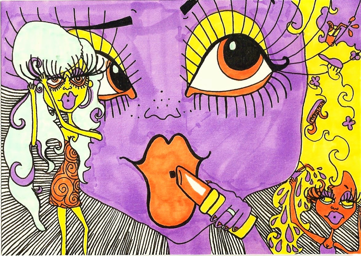
I've now tried to use my imagination to convey the feeling of drunkness and its effects on balance, blurring of sight etc. Below are some of my drawings using promarkers and a black fine liner on card. I did these without any reference material however if I were to follow these through with a final piece I would definitely use some reference material for elements such as hands/accessories/clothing and drinks. I used black fine liner to draw clear outlines and details and then I used pro-markers to colour the piece in a block colour. I chose to use pro markers as they don't show up the pen strokes very clearly; I wanted to have one strong block of colour rather than distracting lines. I used key elements I think are crucial with how some people, mostly girls, want to head out looking like; massive fake eyelashes, long legs, massive heels, voluptuous hair, big lips, glamorous earrings (debatable), skinny and big boobs.


I also plan to edit these on photoshop to fill in the colour and make the black lines darker and clearer.

I used acrylic paint to experiment with how the work would look if I was to create it as my final piece. I really like this style cause I think it reflects the way you feel/see the world when you're intoxicated but I don't think it reflects binge drinking enough to the viewer. I also really like the colours, however as they are so lively and fun, the message doesn't get reflected through them; British binge drinking fun but also dangerous; the good and bad.

I thought about reflecting the good and bad by creating two portraits; one getting ready and the other the aftermath or during the night. It seems extreme but it is totally realistic and you will constantly see girls and guys (girls before and after are a more extreme difference) looking a 'mess' in the clubs or after their night... But a few hours before everyone was 'perfectly' presented. The key element in between is getting 'wasted'... Not just tipsy, but drunk to the point you don't care. This dangerous point is portrayed in the latter portrait; makeup helps to highlight the tears and emotion. I drew both of these from my imagination, though if I were to do them as my finals I would use some reference material for some aspects. However I decided I wanted to create one big picture but one that includes a general atmosphere of being drunk; perhaps many individuals.
I began to think about objects that represented Britain and obviously the Union Jack came straight to my mind. I immediately knew that I wanted to use the flag. From far away the audience will see a flag, but up close the scene of mayhem from binge drinking becomes clear.
Peer Feedback:


My peer feedback before I thought of this idea was to create a scene which looked like a party from far away then up close held a sinister side (hands round necks, tears, unwanted pregnancies etc). I thought this would be hard to create given my time restraints seeing as I would have to firstly create a realistic (dimensionally and proportionally) party scene. So if I created a scene within a flag but using a mash up of loads of groups and individuals, this would solve the problem of trying to get the scene to look realistic. They also suggested to keep a dark element but also keep some humour in the work. I think I can easily do this as photographs of people intoxicated are often humorous! (Below one of my sketches shows a man with his trousers pulled down, mooning at the viewer, this is a humorous image, however it also leaves him extremely vulnerable.)


Here are some of my initial sketches looking into how I will execute my work in the final piece. It will be a set of illustrations of people intoxicated/binge drinking but it will be presented in one larger illustration creating the Union Jack, overall it will represent binge drinking Britain; the good, the bad, and the ugly.
I decided to use Biro and the colour scheme of red and blue; the colours of the Union Jack but also two contrasting colours, reflecting the contrasting effects of alcohol. I was incredibly impressed by the use of biro/ballpoint pen in the LCA exhibition in London which I have talked about in this PPP blog post:
http://a-dear1316ppp.blogspot.co.uk/2014/01/lca-keep-your-timber-limber-works-on.html
The work of Cary Kwok 郭紹恒 who is a London and Hong Kong based artist well known for his exquisite ball point pen drawings really stood out to me and I really like how sensitively this media allows him to draw with. Marlene McCarty also used ballpoint to carefully describe the details and materials in her work.
I have chosen to also work in ballpoint/biro as it is essential I have sensitive detailing in my work for the portrayal of the many different characters but also to create a power in the darker and more forceful lines.